Cinema Bites
The goal of this project was to create an app for a Movie Theater that allows users to quickly and easily order snacks, add orders to favorites, and select pickup times at their local theater for guests that prefer pickup over waiting in lines.
The project looked to address any usability concerns with a couple of other options on the market and provide concise user-focused solutions.

To understand the potential user base for the product I conducted 5 interviews with end users. The goal of the interviews was to focus on the viability of a snack ordering application with such limited scope and to identify common trends and use cases among users of other food ordering apps. The research found that snack ordering for a movie theater would only be preferred if the app significantly cut down on the time in line.
The user pain points were:
Time in line: Users expressed that reducing the time in line was the most appealing feature of the app
Cold Food Items: Snack freshness was the primary concern of the app’s main user flow
Time in App: The user experience would have to be equivalent or shorter than the time it would take to order items normally
Repeat Orders: Users that order similar items every time would like the ability to save orders for later
With User Pain points in mind, I created two personas and user journey maps. These really helped me get a handle on the core demographic for the app.
-
Persona: Rebecca
Rebecca is a Mother who needs to be able to order snacks for her children ahead of time so that they don’t have to wait in line.

-
Persona: James
James is a Tech assistant who needs to be able to order snacks ahead of time because they want to spend more time with their friends at the theater.

Competitive Audit
A competitive audit was performed to compare the User Experience of the each competitors snack ordering function. The Audit also included the existing Marcus Theaters snack ordering function. Key Competitors include: AMC Theaters, a family friendly chain that emphasizes artisan films; Cinemark Theaters, a chain that focuses on providing a luxurious experience; and Alottabox, a snack delivery service with a movie snack box that can be delivered to your home.
Wireframing
Process Mapping
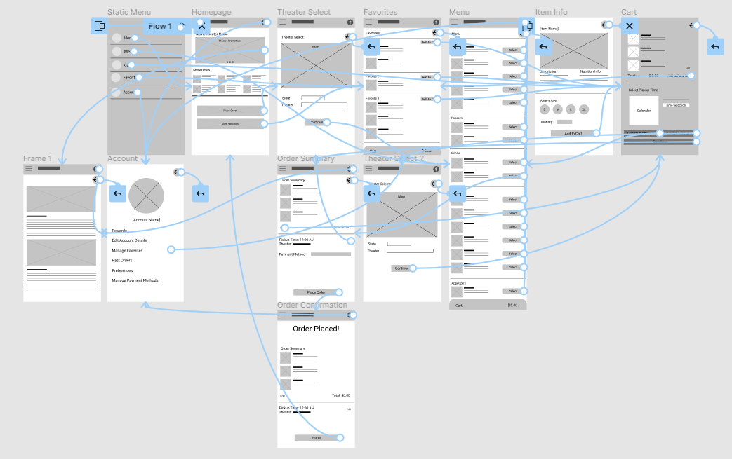
Before committing to a look or feel I created a process map to better understand the core user flow the app would have to accommodate. The goal was to have as few screens as possible while also accommodating the features that the interviews highlighted.
Paper Wireframes
The paper wireframes were to determine what an effective home screen would look like. The final design would borrow elements from all of the wireframes but would rely most heavily on the first one.
Figma Low-Fidelity Wireframes
The home screen was designed to be simple and appealing with a 2 large buttons that bring the user into the main user flow. The main user flow splits here with either the theater menu or the saved favorites menu. The Favorites menu was a direct reflection of UX research revealing users often order the same items every time.
Figma Prototyping
Once the Figma Wireframes were complete the prototyping began! Prototyping revealed some inconsistencies in page layout that were fixed before usability testing began! I also grappled with how to integrate the Theater Select Screen into both user flows for testing. In the end I chose to allow the user to change their theater before Checkout. This would rely on some menu similarity across locations but I believe most of the concessions to be available in most theaters.
Conducting the Usability Study
-
The Usability study was created and sent out to participants as a survey with a link to the low-fidelity prototype. The Goal of the Usability study was to determine if the app allowed users to complete the core task of the app, ordering snacks, with minimal issues. Research results were used to refine the user experience as I moved into the high fidelity and mockup stages of the project.
-
The Core Research Questions we aimed to answer were:
Were Users getting stuck in the main user flow?
What can we learn from the challenges users face in the app?
Are Users able to find the items they would like to order?
Is the User experience preferable to waiting in line?
What can we do to streamline the ordering process?
Is the In-App Navigation effective?
The Key Performance Indicators were:
Time on Task
User Error Rates
Conversion Rates
The Research questions and Key performance indicators aimed to address the core user concern: Is the app faster and preferable to waiting in line?
-
I chose to use an unmoderated usability study due to the limitations of the Coursera program and my access to participants. Each participant had visited a theater at least once a month and had ordered concessions while there. These criteria were key to getting a sample of the end-users. Each session was roughly 30 minutes long and consisted of a brief overview, a lists of tasks, and a short interview after they had completed the main user flow.
-
The “Cart Screen” should show a calendar to aid users in selecting a date.
“Quick Menu” Button is not necessary
“Theater Select” screen should show a map
Research Notes and Affinity Diagram
Refining the Design
After the Low-Fidelity Usability Study i made changes to the design based on the results and started creating the High-Fidelity mockup.
Theater Select Before and After
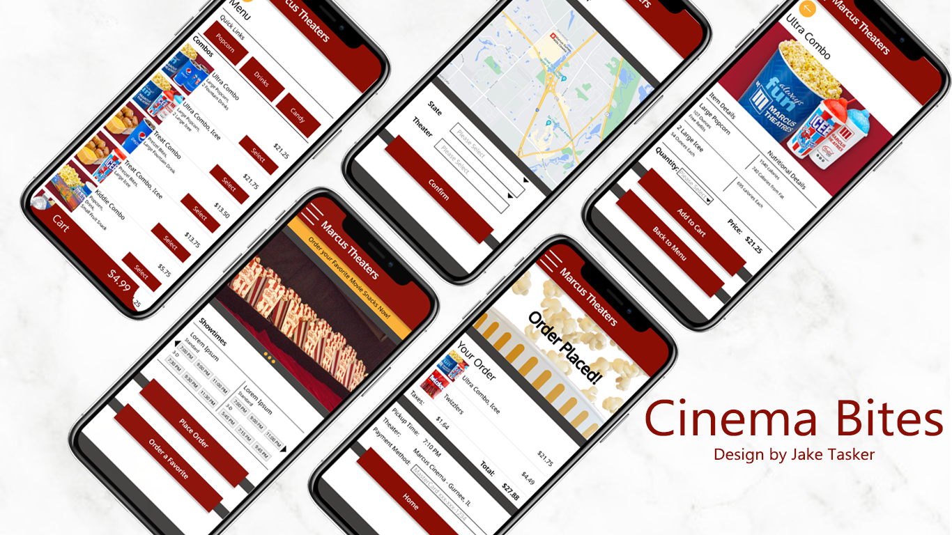
After the Usability Study I added a large interactive map to the theater select screen
Main Menu/Home Screen Redesign
After the Usability Study I redesigned the Home Screen to show only the two large buttons leading the user into the main user flow.
High Fidelity Mockup
The mockup took the findings from the usability study and used them to inform the final design. The Large map was added to the theater select screen and the redesigned home screen provided a simpler entry point for new users. The Final design uses the existing color palette of Marcus Cinemas and some of the menu pictures.
Accessibility Considerations
All of the buttons use high contrast color pairings for the font and button fill
Buttons that move the user through the Main User flow are the same size and always at the bottom of the screen
Animations are smooth and consistent across the mockup. Slide animations were used to emphasize the users linear movement
Key Takeaways
Cinema Bites is a large update to the existing snack ordering function of my local movie theater. It is more user friendly and features a more accessible interface that should decrease the user error rates.
During the project I learned a lot! As my first UX project it was a huge undertaking. I learned that users can rely heavily on familiar app structures to navigate new interfaces. The importance of animations in conveying a sense of forward progression was also something that stuck out to me. Without the animations the users were confused about their location in the main user flow and were unsure if they were making any progress while navigating the menus.
Next steps for this project would be a final usability study to fine tune the mockups animations and buttons before handing it off to engineering. A wide release and replacement of the existing snack ordering UX would soon follow!


