Cooking Codex
The goal of this project was to create a reactive website for a cooking tutorial website that allows users to look up and participate in tutorials that build on the skills they already have while providing a catalog of recipes that utilize the skills learned.
The project looked to address any usability concerns with two other options on the market and provide concise, user-focused solutions.

The process for this project started with 5 interviews with potential users. I wanted to understand what users would want out of the end product and what their pain points were with the existing products on the market. Cooking tutorials/recipes are relatively common and I knew that I would have to present some unique value to the product to make an impact.
The assumption going into research was that users would benefit from being able to sort recipes/tutorials by skills needed and necessary equipment. However, the initial user research found that the product should focus on sorting tutorials and recipes by ingredient and perceived difficulty instead.
Pain Points:
Recipe Overload: There are a lot of recipes online, finding one is more time consuming than it should be
Skill Level Indication: Users would like to know how difficult a recipe will be at a glance
Specialized Tools/Equipment: Users wanted to know if they would need a specialized tool to complete a recipe
Progression: Users wanted a way to track progress and have a path to “level up” their skills
With these user pain points in mind I created two personas and user journey maps to help me understand the end user group for this product.
Persona: Lawrence
Lawrence is a Sales rep who needs a website to easily find and view cooking tutorials because he is overwhelmed by the amount of recipes he finds online.
Persona: Sarah
Sarah is a school teacher that would like to improve her hobbyist cooking skills but doesn’t have the free time to regularly attend classes.
Competitive Audit
I performed a competitive audit on the User Experience of a few key competitors. Included in the Audit were 2 free cooking tutorial channels/sites via YouTube and 2 paid dedicated cooking classes. The goal with the audit targets was to represent a number of ways that end users might already be searching for culinary content.
Wireframes and Prototyping
Paper Wireframes
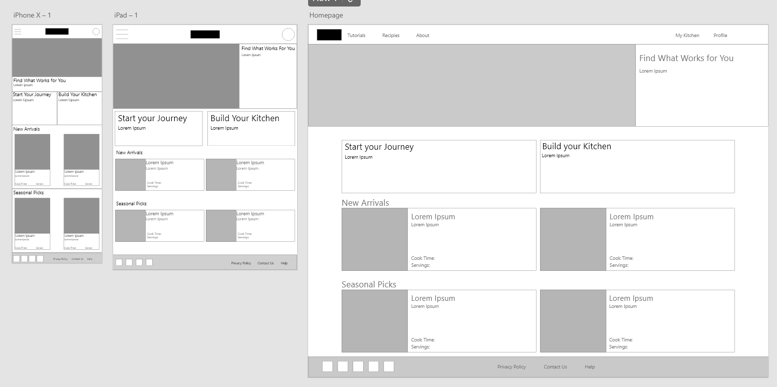
The goal with the overall design was to keep the recipe cards at the heart of the design as snippets representative of a larger process. The filter page looked to only show the user what they wanted to see instead of every recipe available to them.
Digital Wireframes
From the paper wireframe to the digital wireframe, the focus was reducing visual clutter and maintaining a visual weight that wouldn’t overwhelm the user. The recipe cards and simple homepage design would stay relatively similar throughout the process.
Adobe XD Prototyping
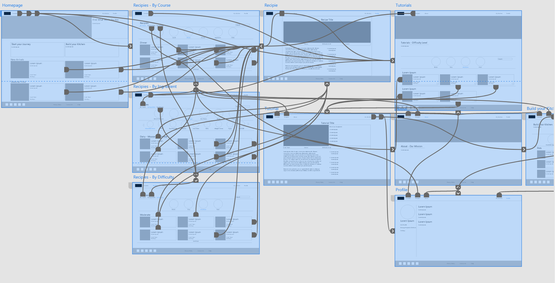
Once the wireframe was done the prototyping began! There was a definite focus on creating a sense of consistent movement through the site. The recipe search and tutorial search process were very similar so I wanted to make sure they both moved the same way.
Conducting the Usability Study
-
The Usability study was created and sent out to participants as a survey with a link to the low-fidelity prototype. The Goal of the Usability study was to determine if the site was intuitive and easy to use . Research results were used to refine the user experience as I moved into the high fidelity and mockup stages of the project.
-
Core Research Questions I aimed to answer were:
+ Were Users getting stuck in the main user flow?+ What can we learn from the challenges users face on the site?
+ Are users able to find the recipes/tutorials they would like to use?
+ What can we do to encourage user interaction with the tutorials?
+ What can we do to index the main content of the site to make it accessible to all users?
Key Performance Indicators were:
+ User Error Rates
+ Use of Navigation vs. Search
+ Time on Task
-
I conducted an Unmoderated Usability study in the United States over the course of two days. An unmoderated study was selected because of time limitations. I would have selected a moderated study if I had more time with participants.
Each session lasted 20-30 minutes. Each participant had either cooked a little or had expressed interesting in becoming a better chef with a similar site.
-
User research found the below points
+ The website needs a search bar
+ Recipe search page needed different filter options to decrease information overload
+ Build your kitchen page needed to be moved to be more easily accesible
High Fidelity Prototype
Accessibility Considerations
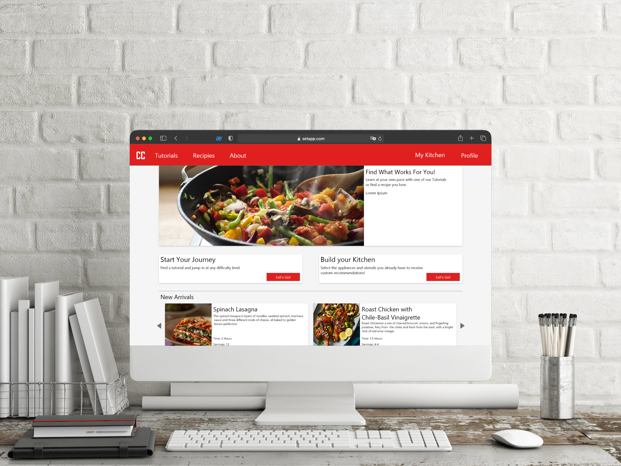
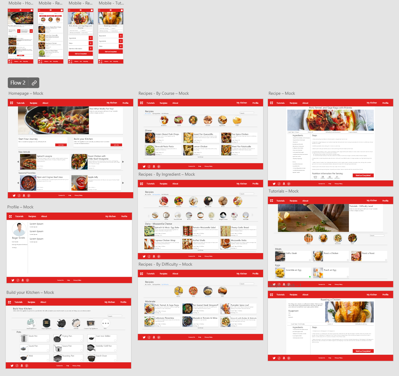
The final iteration on this design took the findings from the usability study, added a coat of bright red, and put it all on display. I kept it simple, using recipe cards, circular sorting buttons, clean dividing lines, and bright vibrant images to make a site that appeals to users and is easy to use. A search bar was added to the advanced search page, a drop shadow was added to all of the recipe cards to imply clickability, and a plethora of sort and sub-sort options were added to keep on screen clutter down to a minimum.
From the start of the project the goal was to create something that wouldn’t intimidate novice chefs or hobbyists but would still offer robust search options that would make it easy to find what you were looking for. I think this final design makes good on those goals.
Some accessibility considerations I used while designing:
+ High contrast font/background color on all text and buttons
+ All recipe cards are laid out similarly and recipe and tutorial cards are the same size in search
+ Negative space is used to create visual separation of elements
Key Takeaways
Cooking Codex was the second UX project and the first desktop site I had ever created. The design accomplished the goals set after initial user research and I am proud of the final design. As a ground-up design, it is likely not perfect but it should preform well for users and I believe the usability testing during the low-fidelity prototype stage was instrumental to lowering user error rates and increasing conversion rates within the recipe and tutorial search function.
I learned a lot during the process. The most difficult thing to adjust to was all of the space that a desktop design allows you. Coming from the mobile design of Cinema Bites, Cooking Codex was a challenge. The recipe cards are large but not too large, the banner image was difficult to size appropriately, and there is likely too much negative space on some of the pages but I think I did well in balancing the needs of the design with the needs of the end Users.
Next steps for this project should be a final round of Usability testing to catch anything that was lost in translation from low-fidelity to high fidelity. Before release we would also need to build out a better profile page as the one present in the final design is a placeholder for something with more user information. After all of that the design would be ready for wide release!


