My Law Alert
The goal of this project was to create a scalable website to alert users about newly proposed bills that affect their profile based on self-selected tags and provide a centralized site to view proposals at all levels of government.
The design started as a mobile website and was scaled up to fit a tablet and desktop screen size.

The process for this project started with 6 interviews with potential users about their pain points and concerns with the law making process and staying informed on local and federal policies.
The assumption going into research was that the biggest concern with staying informed would be reading the full text bill and users researching on their own. However, the initial user research found that it was aggregation of information and notification of changes that users were more concerned with instead.
Pain Points:
Notifications: Many users only heard about policy change via bills that made the news, they would like to be notified about less notorious but still relevant bills
No Single site: potential users lamented the fact that there is no single site that shows both local and federal policies
Contacts: Most of the users were unaware of who their representatives were and of the process to contact their representatives if there was a bill on the line.
With these User Pain points in mind I created two personas and user journey maps to help me understand the end user group for this product.
Persona: Gavin
Gavin is a father and active community member who needs a way to view newly proposed bills because he wants to be informed about any changes to his school districts’ funding.
Persona: Ramsey
Ramsey is a family man who needs a way to stay informed on local legislature on the go because he is often busy between work and his family.
Competitive Audit
I performed a competitive audit on the User Experience of a few key competitors. Included in the Audit was GovTrack, the main competition to this project. They alert users to new bills and allow users to read the full text but do not offer those same features to local bills. I also audited the federal and state web archives for proposed bills as they are the alternative to services like GovTrack and this product.
Ideation, Wireframes, and Prototyping
Ideation
During the ideation phase I really tried to find a way to present the various bill sources (state, federal, and tracked) that users talked about in earlier research. I tried two columns, a divider and tabs under the Hero image. I’m the end I would pick the elements I believed to offer a balanced and intuitive layout.
Paper Wireframes
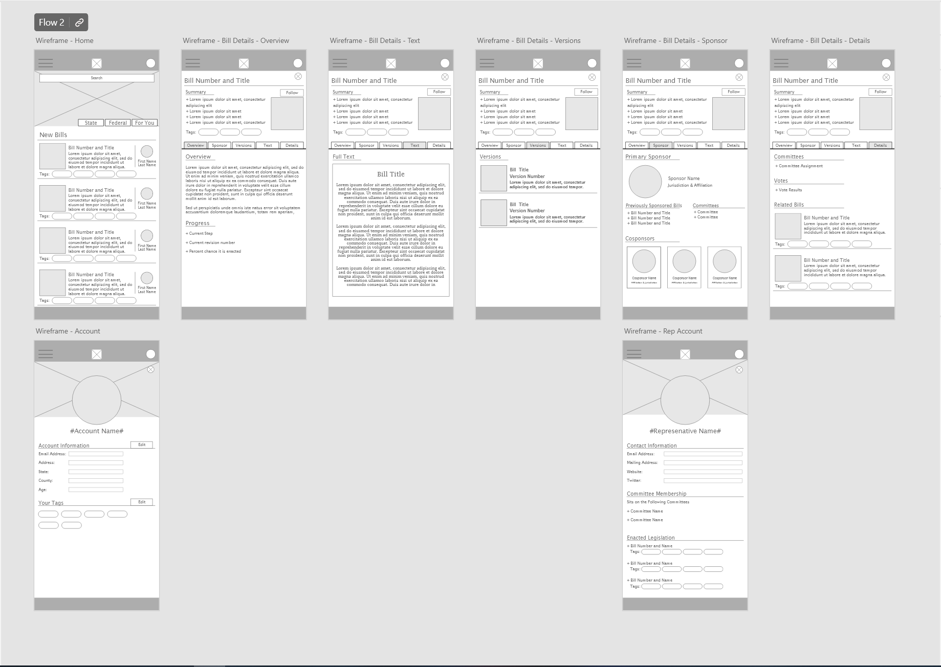
In wireframing I pulled together the best elements from ideation and refined them a bit. I settled on using tabs to keep lots of information accessible on one screen. The homepage and the bill details screen would both use tabs to increase visual consistency.
Digital Wireframes
The digital wireframes reinforced one thing for me: fitting information on small cards is difficult. Spacing the bill detail cards on the home page was a challenge that I was not expecting but one I welcomed. In the end the bill details page impressed me the most though. When the tabs started to fill out I was excited to test and see what the users would think of this solution!
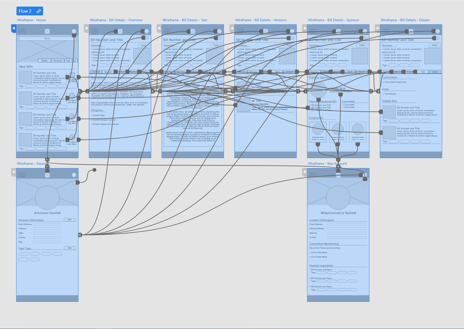
Adobe XD Prototyping
Prototyping was relatively straightforward. Since 5 of the pages were able to use the same tab component it came together in a few minutes. The prototype was ready for testing the main user flow!
Conducting the Usability Study
-
The Usability study was created and sent out to participants as a survey with a link to the low-fidelity prototype. The goal of the survey was to determine whether or not the site was intuitive to use and whether or not the users could complete the main user flow from home page to bill/proposal full text.
-
Core Research Questions I aimed to answer were:
+ How long does it take a user to find a representative in the app?
+ Are there parts of the user flow where users get stuck?
+ Are there more features that users would like to have in the App?
+ Do users think the app is easy or difficult to use?
+ Do users think the “tags” system is intuitive and useful?
Key Performance Indicators were:
+ Time on task
+ Conversion Rate
+ System Usability Scale
-
I conducted an Unmoderated Usability study over the course of 3 days. Participants were all citizens of voting age that were either already participating or would like to participate more with Federal, State, and local politics.
The survey was designed to last about 10-15 minutes with a system usability scale survey after the prototype demonstration.
-
User research found the below points
+ Tags are less important as a means of recommending bills but still useful for search functionality
+ Users want to be able to save bills for later viewing
+ Search is not the main way that users will navigate the site
Responsive Size and More Wireframes
High Fidelity
After the usability study and some iterating on the mobile design it was time to take the site to a few new screen sizes. Before going to high fidelity I worked on wireframes for the tablet and desktop sites so that if any issues were found in scaling the site up, adjustments could be made to each size to maintain consistency. With a larger screen size the home screen is able to fit more than just the initial upcoming bills that the mobile screen was limited to. The homepage was expanded to allow for a trending section and an informative “From a Bill to a law” excerpt to explain the legislative process to any user that is unfamiliar.
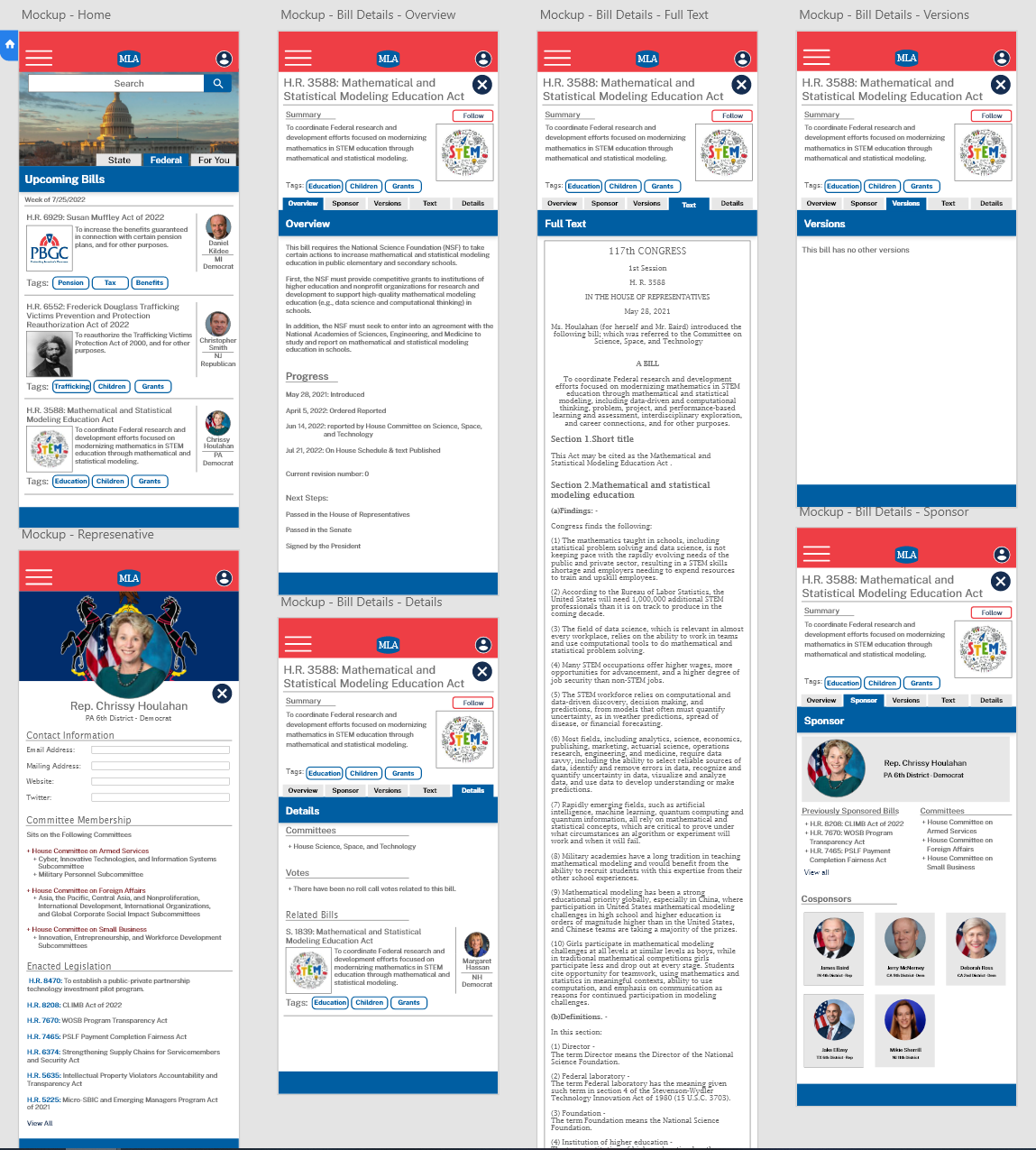
The high fidelity prototypes/mockups use a patriotic color palette lifted from the federal government style guide. The use of color for titles and bill numbers was added after iterating on the web design. Overall the site sizes are consistent in information location and should feel familiar to any user. With each size up the home screen adds a new column of information. This should feel intuitive to most users. The Bill details screen remains mostly the same throughout the resizes.
Feedback from a small round of user testing with the high fidelity prototypes pointed out that there were no back buttons on the web and tablet versions and that some of the font choices were not easily readable on the larger header of the web and tablet screen sizes. The font was changed to a semibold and back buttons were added to the bill details screen and it was finished!
Accessibility Considerations
Some accessibility considerations i used while designing:
+ High contrast font/background color on all text and buttons
+ All bill cards are the same size across the design
+ All buttons are similarly sized and colored to increase continuity
Key Takeaways
My Law Alert was the final project in the Google UX Design course and by far the most difficult. The prompt was to design a site for social good and I cant think of a better way to encourage social good in the US than increase citizen engagement with the government and the bill making process. I think this site could do some real good if it were adopted by enough users. With some marketing and pushing, a non-profit site that fulfills a similar role to this design could bring the people closer to the government than ever before.
This project was not without its learning moments though. Throughout the project I learned about the importance of separation for large amounts of text on a page. I also learned that scaling up from a mobile screen to a desktop screen comes with its own challenges! Scaling a single column design to a triple column design taught me just how important negative space is and that giving everything its own weight is important to visual clarity. The users taught me, once again, that the simple things —like back buttons—are critical in having a smooth user experience.
Some next steps for the project would be some new design for a search page that incorporates the tag system the base site introduces and a more robust profile page. After that I believe the site would be ready for publication! Looking to future improvements, I think the next step for the site would be ideating on a way to tag bills based on the Users ability to reach out to the sponsor/co-sponsor of a bill. I believe this would increase the likelihood of citizen engagement with the legislative process!


